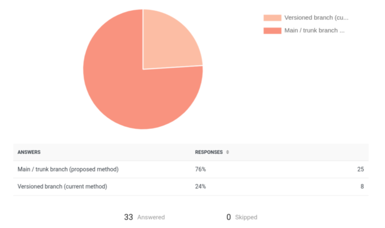
Before moving full into the Apple economy, purchasing the developer license (of which I’m still unsure is something I want to do), and trying to port the web app into an iOS app, I’ve been refining the web app to follow standards that more closely align with mobile user interface and user experience patterns.
So, four weeks later, I’ve another version of Where Can I Watch that’s available here.
A month ago, I launched and shared Where Can I Watch? The search functionality was overhauled (which was triggered when I saw how long it took to load a franchise – for example, searching for superman or batman brings back a high number of titles which was taking far longer than it should). The new implementation handles searching in a way that’s more performant and that’s easier to making API requests to conserve data when doing so over a cellular connection.
At first glance, it’s obvious the UI has been overhauled:
In addition to removing light mode, I also stripped out all of the emojis as I’m not a big a fan of them. Further, they aren’t part of typical mobile app design language nor are they part of the iOS human interface guidelines.
For those interested, the changes to the API ultimately resulted in the following:
Finally, I introduced a caching mechanism using Redis on Vercel so that if someone searches a title and then another person searches the same title within a reasonable time window, those results can be pulled from the cache without having to initiate yet-another-API-call.
Further, adding international support for titles is also something that I’d eventually like to incorporate. First, though, I’d like to get a stronger foundation of the service completed.
Where Can I Watch: New Features, Improvements, and Reductions
For those that caught an intermediary version of the app from last month, I’d introduced a feature where if a title wasn’t playing in the United States or wasn’t available for streaming, I’d add it to a ‘Not Streaming’ tab; however, this tab negatively impacted the UI so I’ve hidden that functionality for now.
The dark mode and light mode toggles have been removed in favor of the full dark mode. This is something that could eventually be restored especially when the mobile app is done (if it’s ever done), but I’m partial to this aesthetic so I’ve stuck with it.
But there’s been a lot of stuff I’ve done on both the frontend and the backend of the app to both add features, improve performance, and bring greater parity to what we’re used to seeing within actual mobile apps.
New Features
The thing is, it’s not a mobile application. Instead, it’s a web app that runs in the browser so it’s available on as many devices as platforms as possible. But over the past few weeks, I’ve been working on seeing how feasible it would be to begin converting it to an actual mobile application.
If you read the initial post, you know I described it as:
A mobile application that makes it easy to find where to watch a show or movie.
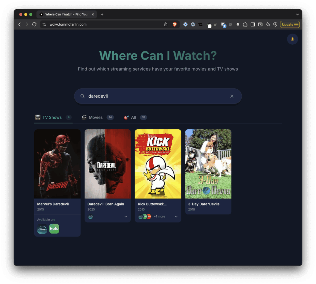
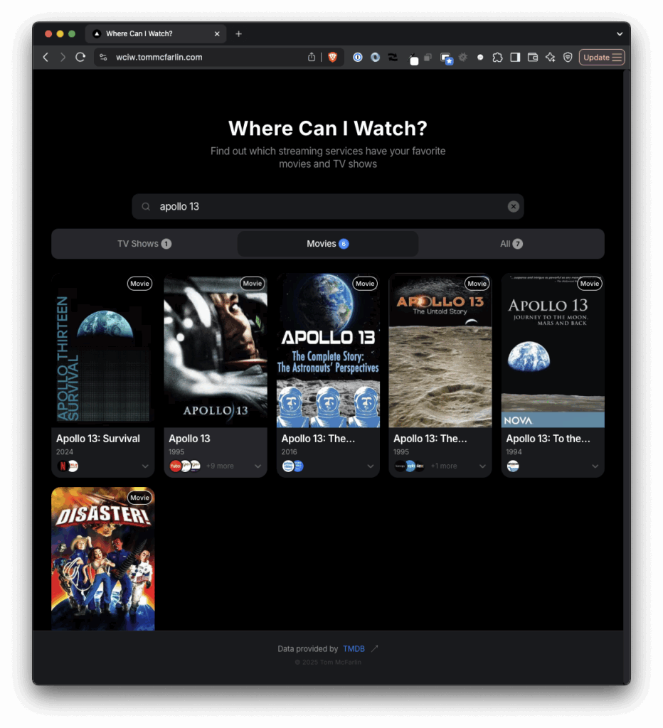
Each show and movie also includes a link to the IMDB page for the title in case you’re interested in a synopsis, run time, trailer, and all of the other stuff that is outside the scope of the app.
Improved Performance
When I first shared this online, I described both its impetus and purpose like this:
The most significant change is a complete visual and interactive overhaul to match native iOS patterns. This includes everything from the typography and color standards, as well as the grid system. I’ve also added the spring physics animations we’re used to seeing in our mobile apps.
That said, I appreciate the notes for those who’ve used this incredibly simple app so far. It’s always fun to hear that it’s something useful for someone else. And for as basic as it is, it’s been a lot of fun and to put it together and to stretch into areas that I don’t normally work
A few months ago, one of my kids was asking where should could watch a specific show.
- Before: Individual API calls per result (100+ requests for large searches)
- After: Batched requests with chunking (2-3 requests maximum)
- Impact: 95% reduction in API calls, dramatically faster loading
What Was Removed
As I’ve done with the last two posts, I’ll continue to document the progress.
Though the app is still built using Next.js and running on Vercel, I’m currently working on trying to build a shared backend and create one front-end for the web that maintains what’s available today and another front-end using React Native that will allow for an iOS version of the app.
Where possible, I implemented GPU acceleration animations for better performance and reduced motion affects for accessibility. Further, I tried to add aria labels across components to play well with accessibility.
Conclusion
Finally, I separated out the services where a title can be streamed versus where it can be bought or rented.
If you’re interested in using the app to find where you can watch any given show or movie, then go ahead and visit the site. If you’re interested in more of the technical details of this version, read on.
Coincidentally, I was also looking for a small project to work on on the side so I took her question, where can I watch whatever-the-show-is, and turned it into a simple app.